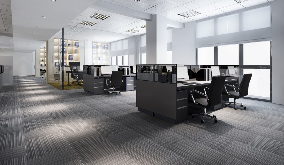
The colors inside your business do more than just decorate your space. Interior commercial painting decisions can actually influence your customers, employees, and overall brand perception. In fact, understanding color psychology in business interiors could be the secret to boosting productivity, improving customer experience, and even increasing sales.
If you’re about to repaint your office, storefront, or commercial space, it’s worth learning what each color can say and how it might affect your business. Let’s dive in.
Key Takeaways:
- Interior commercial painting affects customer emotions and employee performance.
- Each color conveys a different message—some invite, others repel.
- Choosing the right interior colors aligns your space with your brand values.
- Color psychology can be a competitive advantage in commercial design.

Why Color Psychology Matters for Business Interiors
Color isn’t just visual—it’s emotional. People respond to color on a psychological level, even if they don’t realize it. For businesses, this means the paint on your walls is more than an aesthetic choice. It’s a tool. A well-chosen color scheme can:
- Increase productivity among employees
- Encourage customers to stay longer
- Boost mood and focus
- Influence buying behavior
A poor color choice, on the other hand, can create stress, lower morale, or even drive customers away. That’s why understanding color psychology in business interiors is essential before making any interior commercial painting decisions.
The Psychology Behind Popular Business Interior Colors
Known for its calming and professional qualities, blue is often used in offices and healthcare settings. It promotes trust, peace, and productivity.
Energetic and bold, red can stimulate urgency and excitement. This is useful in environments like restaurants or retail shops where action is key.
Associated with growth and balance, green is a great option for wellness centers or eco-friendly brands. It’s easy on the eyes and promotes a sense of harmony.
This color is linked to creativity and optimism, but in large doses, it can cause anxiety. Use yellow as an accent to spark joy and inspiration.
Sophisticated and neutral, gray is often used in corporate environments. However, overuse can feel dull or uninspiring if not balanced with warmer tones.
Clean and minimal, white promotes clarity and openness. It can also feel sterile if not paired with warmer shades or textures.
Powerful and elegant, black is best used as an accent to convey authority or luxury.
Choosing the Right Colors for Your Type of Business
Different industries benefit from different colors. Here’s a quick guide:
- Retail Stores – Use vibrant colors like red or orange to encourage quick decisions and impulse buys.
- Offices – Stick to blues and greens to improve focus and reduce stress.
- Spas & Wellness Centers – Soft greens and neutrals create a calm, restorative atmosphere.
- Restaurants & Cafes – Warm colors like red, orange, or yellow can stimulate appetite and conversation.
- Boutiques & High-End Stores – Incorporate blacks, golds, and deep purples to evoke luxury and exclusivity.
How to Align Color with Your Brand Identity
Think of your brand’s core values and personality. Is your business fun and youthful? Calm and professional? Bold and innovative?
Use your answers to guide your color palette. For example:
- A cutting-edge tech startup might lean toward clean whites and cool blues.
- A family-owned bakery could use warm tones like peach, cream, and soft brown.
- A fitness brand might go bold with reds and energetic yellows.
Make sure your colors are consistent across marketing materials, signage, and your interior commercial painting choices to create a unified brand experience.

Mistakes to Avoid in Interior Commercial Painting
Even the best color palette can fall flat if common mistakes aren’t avoided. Here are a few pitfalls business owners should watch out for when planning their interior commercial painting strategy:
- Choosing based on trends only – Just because a color is popular doesn’t mean it fits your brand. Trendy hues may clash with your business’s core values or confuse customers who expect a different kind of atmosphere.
- Ignoring lighting – Lighting can completely change how a color looks on the wall. Natural daylight, fluorescent lighting, and warm-toned bulbs each bring out different tones. Always test paint samples under your actual lighting conditions.
- Using too many colors – A rainbow of colors might sound fun, but in practice, it overwhelms the senses. Limiting your palette to two or three core colors with complementary accents helps create cohesion and a sense of professionalism.
- Forgetting the customer journey – Think about how people move through your space. Use color as a subtle guide—highlight areas of importance, create zones of activity or relaxation, and make navigation intuitive with strategic color placement.
Hiring a Professional vs. DIY
While it might be tempting to tackle a paint job yourself, commercial spaces often require:
- High-quality, durable paint
- Special finishes
- Complex design layouts
- Fast turnaround without disrupting operations
Professional interior commercial painting services ensure your color vision is executed correctly, safely, and efficiently.
Color Psychology: A Smart Investment for Your Business
Using color psychology in business interiors isn’t just about style—it’s about strategy. When you choose your colors intentionally, you’re making a subtle yet powerful investment in your brand, your people, and your customers.
Before you grab a paint swatch, ask yourself what you want your space to communicate. Then choose the colors that do the talking for you.
Ready to bring your business to life with the right colors? Contact Liquid Oak Painting at 213-526-1070 to schedule your interior commercial painting consultation today. We’ll help you choose a color scheme that works for your space—and your bottom line.


